Adventures In Computing: Visualizing Failed SSH Logins
For access to the home network when I’m away, I have a Raspberry Pi
exposed on port 22. As you can imagine, there are plenty of bad actors
who attempt to gain access to it. Fortunately, I have the default pi
user’s password changed, and only login using an SSH key to a non-root
account.
This opens up the possibility for a fun exercise in data visualization: each login attempt has a few attributes:
- The (nominal) source IP of the login attempt
- The date and time of the login
- The port number used
- The username used
I wrote a small Bash script to extract log lines for failed logins and dump them out to a text file, then call a Python script that does more extensive data extraction:
#!/bin/bash
LOG_FILE="${1}"
NONSUDO_USER=${2}

printf 'Extracting failed login attempts from %s\n' "${LOG_FILE}"
grep -E "Failed|Failure" "${LOG_FILE}" > /tmp/failed_logins
chown ${NONSUDO_USER}:root /tmp/failed_logins

printf 'Inserting into SQLite3 database as %s\n' "${NONSUDO_USER}"
runuser -l ${NONSUDO_USER} -c "python3 /data/failed_logins_to_sqlite3.py /tmp/failed_logins /data/failed_logins.sqlite3"

printf 'Finished\n'
This scripts runs as a cron job every day, and updates the SQLite database on the Pi. Each line gets scanned using some regular expressions:
datetime_regex: re.Pattern = re.compile(r"(.*) [a-zA-Z0-9]+ sshd\[[0-9]+\]")
username_regex: re.Pattern = re.compile(r" ([^\s]*) from")
ip_regex: re.Pattern = re.compile(r"[0-9]{1,3}\.[0-9]{1,3}\.[0-9]{1,3}\.[0-9]{1,3}")
port_regex: re.Pattern = re.compile(r"port ([0-9]+)")
And inserted into the database:
dt: str = re.search(datetime_regex, line).group(1)
user: str = re.search(username_regex, line).group(1)
ip: str = re.search(ip_regex, line).group(0)
port: str = re.search(port_regex, line).group(1)

c: sqlite3.Cursor = conn.cursor()
result: sqlite3.Cursor = c.execute(
	SELECT_STMT, (dt, ip, user, port)
)
if result.fetchone() is None:
	c.execute(INSERT_STMT, (f"{args.year} {dt}", ip, user, port))
To do the actual visualizations, I copy the file off of my Pi onto my laptop for processing with Python, geopandas, and matplotlib.
Data sources
The actual log data, as noted above, comes from my Raspberry Pi. The shapefiles used for the various plots come from the US Census Bureau’s download page and the datasets bundled with GeoPandas. For IP address to country/city resolution, I used the free database from MaxMind.
The unreliability of IP geolocation
IP geolocation data is inherently flawed, as the use of proxy servers, VPNs, and spoofing tools means that a particular packet can come from a location completely unrelated to the actual source machine. As noted in various research papers, databases based on observations and legally required registrations are at their best for country-level resolution. Even with that caveat, the existense of various network obsfuscation tools means that the IP address in the logs is really more of the nominal IP address.
Statistical plots
The processing script generates some plots based on the raw statistics of the failed logins.
Port numbers
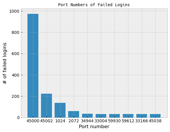
The port numbers were a little surprising. Port 22 is the default for SSH servers, so I would have guessed it would easily be in the top ten, if not in the top slot itself.
Usernames
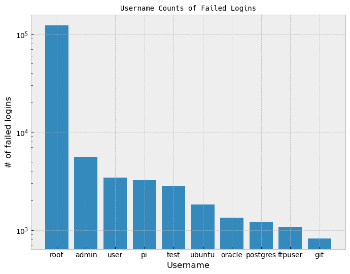
Unsusprisingly, root is far and away the most used username for an
SSH login attempt. It’s the default superuser name for Linux machines,
so it’s not a bad guess.
Country of origin
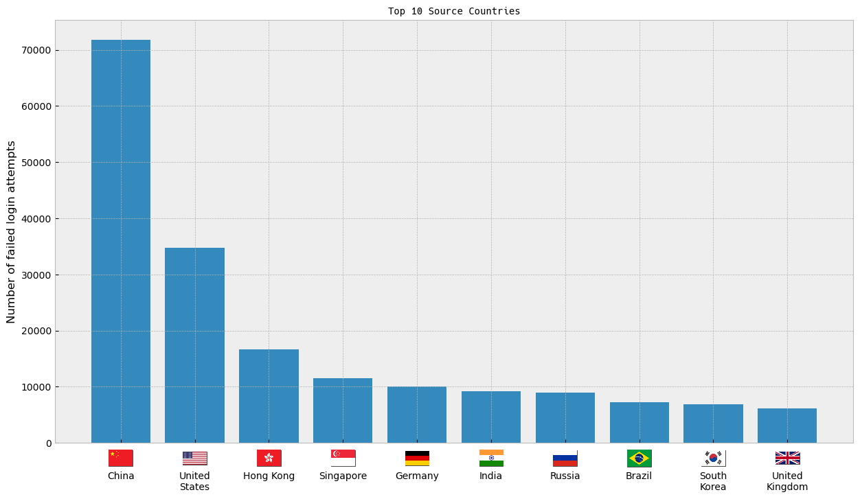
The flag images here came from hampusborgos/country-flags, which is a collection built from Wikimedia flag images in the public domain.
Here’s an interactive timeline chart where you can compare between various countries (done with Plotly):
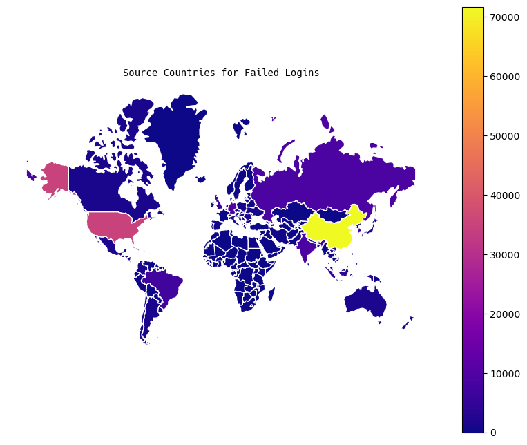
Maps
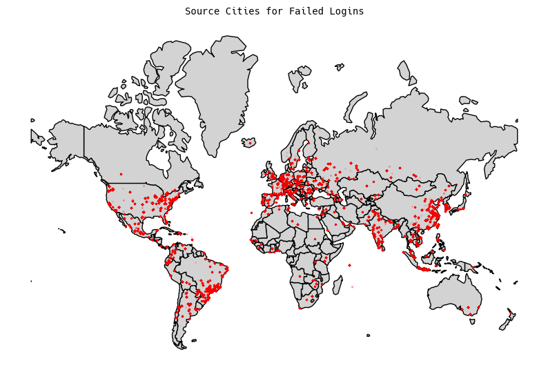
World Maps
For the world, I generated two plots: a chloropleth map, and a city-level map (keeping in mind the caveats from above about city-level IP geolocation).
US Maps
For the United States, I generated city-level plotting, and it’s about
what you would expect. Lots of hits in Silicon Valley tech centers,
and corresponding hits from East Coast tech hubs: 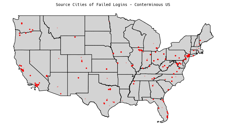
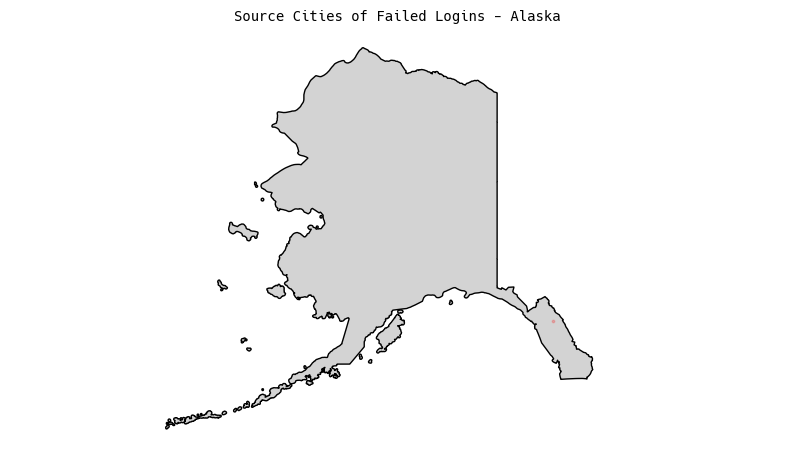
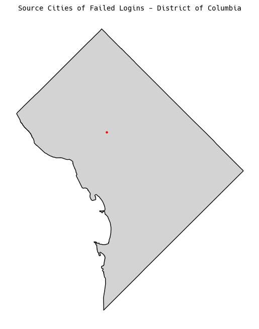
I also generated plots for any of the non-conterminous states that had results:
Conclusion
All in all, this was a pretty fun exercise, and I got some interesting insights into where exactly the sources of attempted logins are coming from.