Adventures in Computing: Shell Command Visualization
When you spend enough time on the command line, you start to notice
that you use certain commands a lot. Things like cd, git, and
sudo get used a lot when you use Linux as your daily
driver. Inspired by this Reddit
post,
I decided to create a tool to visualize the data.
Streaming data
Since different shells will provide different history files, a command
that parses different history files will be time-consuming to
write. But most shells provide a history command that simply
provides output like this:
 9989  conda activate data_analytics
 9990  ipython
 9991  make
 9992  make clean
 9993  make
 9994  bat
 9995  make
 9996  cd ~/work
 9997  cd ~/work/byui/instructor-tools/grade-trends
 9998  ls
 9999  eog output/grade_trend_all.png
10000  ipython
This can be streamed to a tool with a Unix pipe:
history | some-tool
Here’s how I did this in Python:
cmds = []
line = sys.stdin.readline()
while line:
    line = sys.stdin.readline().strip()
    matches = re.match(r"\s*[0-9]+  (.*)", line)
    if not matches:
        continue
    parts = matches.group(1).split(" ")
    cmd = parts.pop(0)
This works well enough, but in a *nix shell you can set environment
variables for the duration of a command like this:
ENV_VAR=foo some-command
We don’t want to see environment variables in the output, so we need to skip those:
while re.match(r"[a-zA-Z_][a-zA-Z_0-9]*=.* ", cmd):
    cmd = parts.pop(0)
At this point, I realized that sudo “hides”, in some senses, the
commands that are actually being executed. When I run sudo emacs,
I’m not running sudo to run sudo; I’m running Emacs with elevated
privileges, which is done with the sudo command. It might be nice to
be able to strip the sudo out and see the underlying command. I
added argument parsing with argparse and updated the loop that finds
the actual command:
while re.match(r"[a-zA-Z_][a-zA-Z_0-9]*=.* ", cmd) or (
    args.strip_sudo and cmd == "sudo"
):
    cmd = parts.pop(0)
The full loop is now:
while line:
    line = sys.stdin.readline().strip()
    matches = re.match(r"\s*[0-9]+  (.*)", line)
    if not matches:
        continue
    parts = matches.group(1).split(" ")
    cmd = parts.pop(0)
    while re.match(r"[a-zA-Z_][a-zA-Z_0-9]*=.* ", cmd) or (
        args.strip_sudo and cmd == "sudo"
    ):
        cmd = parts.pop(0)
    if cmd:
        cmds.append(cmd)
Now we can count everything with the collections.Counter, and load
the result into a pandas DataFrame:
df = pd.DataFrame(Counter(cmds).items(), columns=["command", "count"])
The number of commands to plot can be controlled with a flag:
n_largest = df.nlargest(args.n, ["count"])
Now we’re on to the plotting. Here’s the function signature:
def circle_plot(
    data: np.ndarray,
    labels: List[str],
    max_length: int=100,
    ylim_min: int=-50,
    cmap: str="viridis",
    label_padding: int=5,
    background_color: str="gray",
):
    """ Produce circular plot of data

    Args:
      data (np.ndarray): Data array to plot
      labels (List[str]): String labels for data
      max_length (int, optional): Maximum length of bars, defaults to 100
      ylim_min (int, optional):
        Minimum y-value of plot, used to tune how close the bottom of
        the bars are to each other, defaults to -50
      cmap (str, optional): Matplotlib colormap to use, defaults to 'viridis'
      label_padding (int, optional):
        Padding between labels and the end of bars, defaults to 5
      background_color (str, optional):
        Background color of plot, defaults to 'gray'
    """
We start by normalizing the data:
# Normalize data
if not isinstance(data, np.ndarray):
    data = np.array(data)

data_max: np.int64 = np.max(data)
data_min: np.int64 = np.min(data)
data_norm: np.ndarray = data.copy()
data_norm: np.ndarray = (data_norm - data_min) / (data_max - data_min)
Normalizing the data gives us values that are strictly in the interval
[0, 1], mapping a value of 0 to 0, and the highest value
to 1. This converts the visualization of each data point to be
relative to the others. If there’s a command that’s used much more
often than the next-closest count, we don’t want a lopsided plot with
a single huge bar and lots of tiny bars.
Next, we compute the bars:
# Compute bar characteristics
bar_width: float = 2 * np.pi / len(data)
bar_angles: np.ndarray = np.arange(1, len(data) + 1) * bar_width
To plot the bars in a circle, we use a polar projection, which changes
how the arguments to Axes.bar are handled, and then we plot the
bars:
fig, ax = plt.subplots(subplot_kw={"projection": "polar"})

if isinstance(cmap, str):
	cmap = plt.get_cmap(cmap)

bars = ax.bar(
	bar_angles,
	data_norm * max_length,
	width=bar_width * 0.9,
	color=cmap(data_norm),
	zorder=10,
)
To get thing nicely scaled, a y-axis limit was empirically determined, and the ticks are removed for aesthetics:
ylim_max: float = max_length * 2.3

ax.set_ylim(ylim_min, ylim_max)
ax.set_yticks([])
ax.set_xticks([])
To plot the labels, we do some quick trigonometry and figure out where on the unit circle the bar angle will be. This lets us set the rotation and alignment.
for label, count, bar_angle, bar in zip(labels, data, bar_angles, bars):
	rot = np.degrees(bar_angle)
	if np.pi / 2 <= bar_angle <= 3 * np.pi / 2:
		rot += 180
		rot %= 360
		alignment = "right"
	else:
		alignment = "left"
	ax.text(
		bar_angle,
		bar.get_height() + label_padding,
		s=f"{label} - {count}",
		va="center",
		rotation=rot,
		rotation_mode="anchor",
		ha=alignment,
	)
Some additional aesthetics and returning the figure and axis:
ax.grid(False)
ax.set_facecolor(background_color)
fig.set_facecolor(background_color)
for spine in ax.spines.keys():
	ax.spines[spine].set_visible(False)

return fig, ax
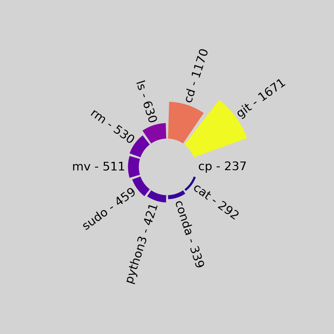
The outputs of the script:
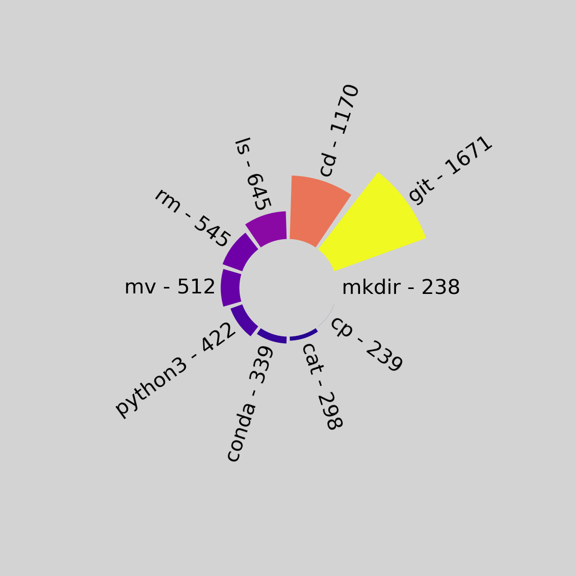
Running with the --strip-sudo flag:
The code is available here, if you’d like to try it out yourself!